The Meeshop Designer is the design system associated with the Meeshop platform. The design system is very user friendly and is both for the creative webshop owner and the less creative one.
The design function makes it possible for you to create beautiful and unique pages for your webshop.
The design system is based on modules that make it easy to change and edit your design.
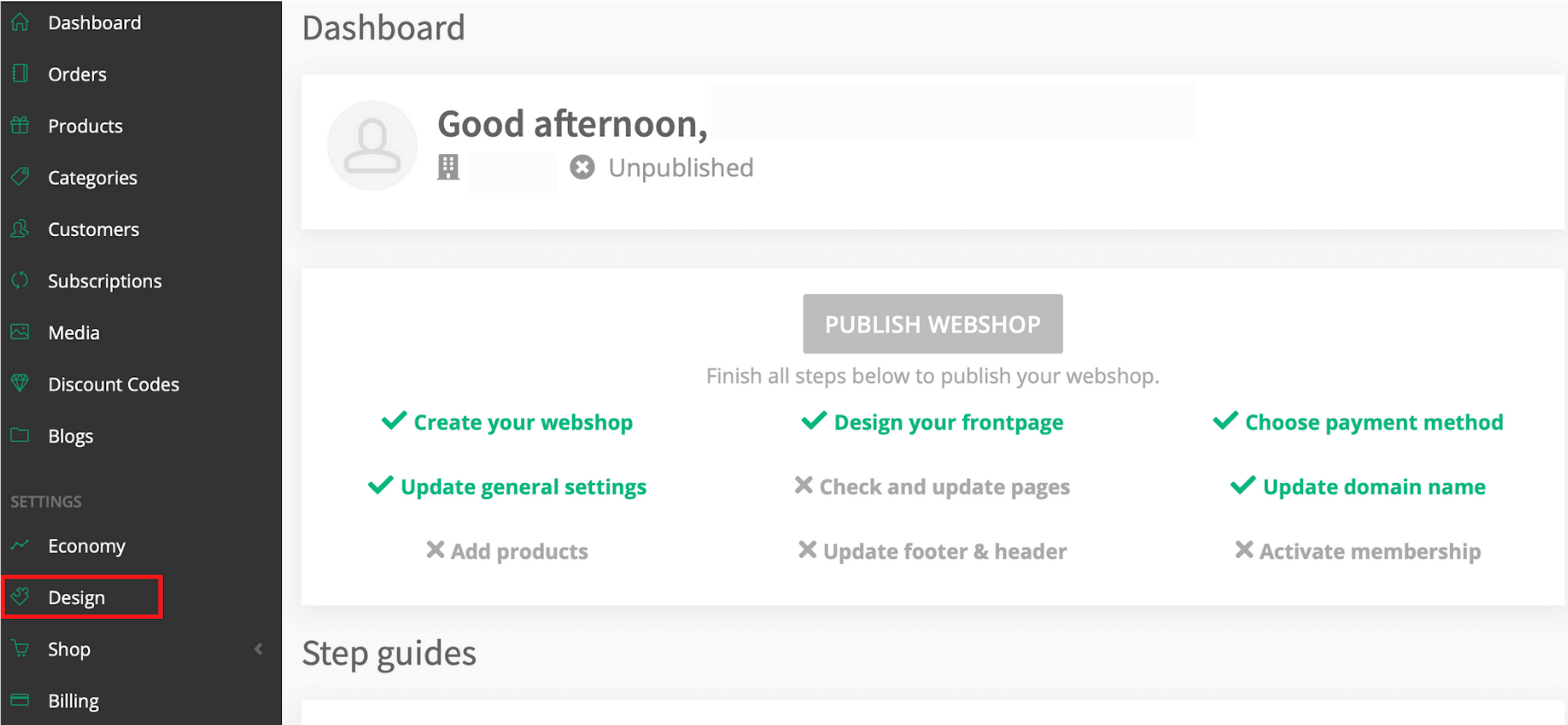
Start designing your webshop by clicking on "Design".
When you go to the design page you'll be presentet with four options.
The four options are: Settings, Header, Pages, Footer.
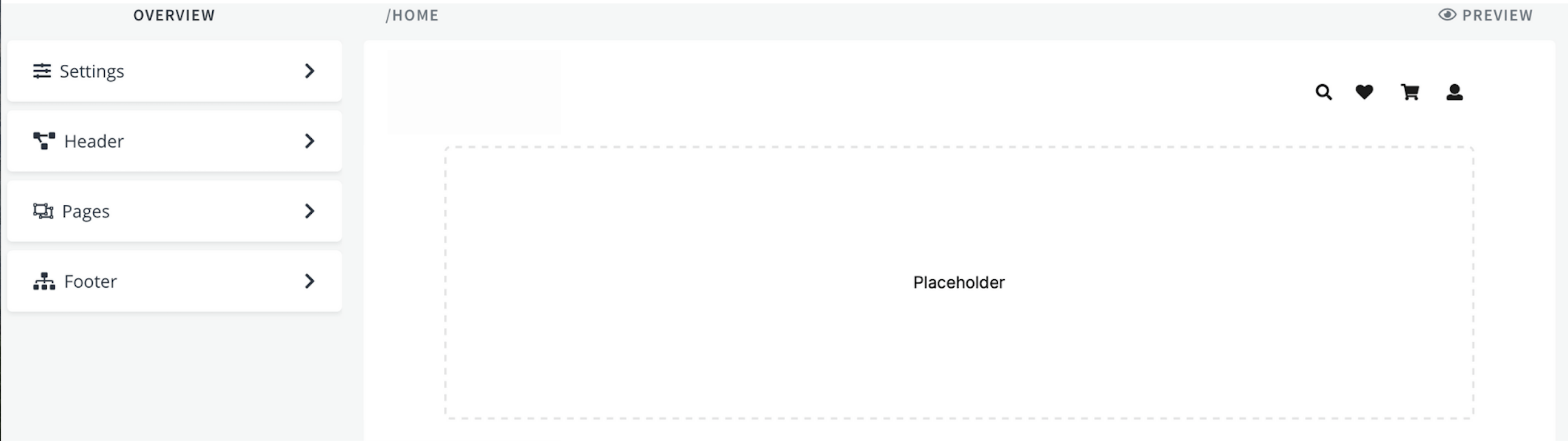
Settings
Under setting you can upload your Favicon and your brand color. The Favicon is small 16x16 pixels icon. It's displayed in the browser's address bar next to the site name and in a bookmark list. Typically you put in your logo as your Favicon.
The brand color is the color associated with your webshop, the color will for instans apper at your check out page and on new products.
E.g. Blue (both button and the price will show in the chosen brand color).
Header
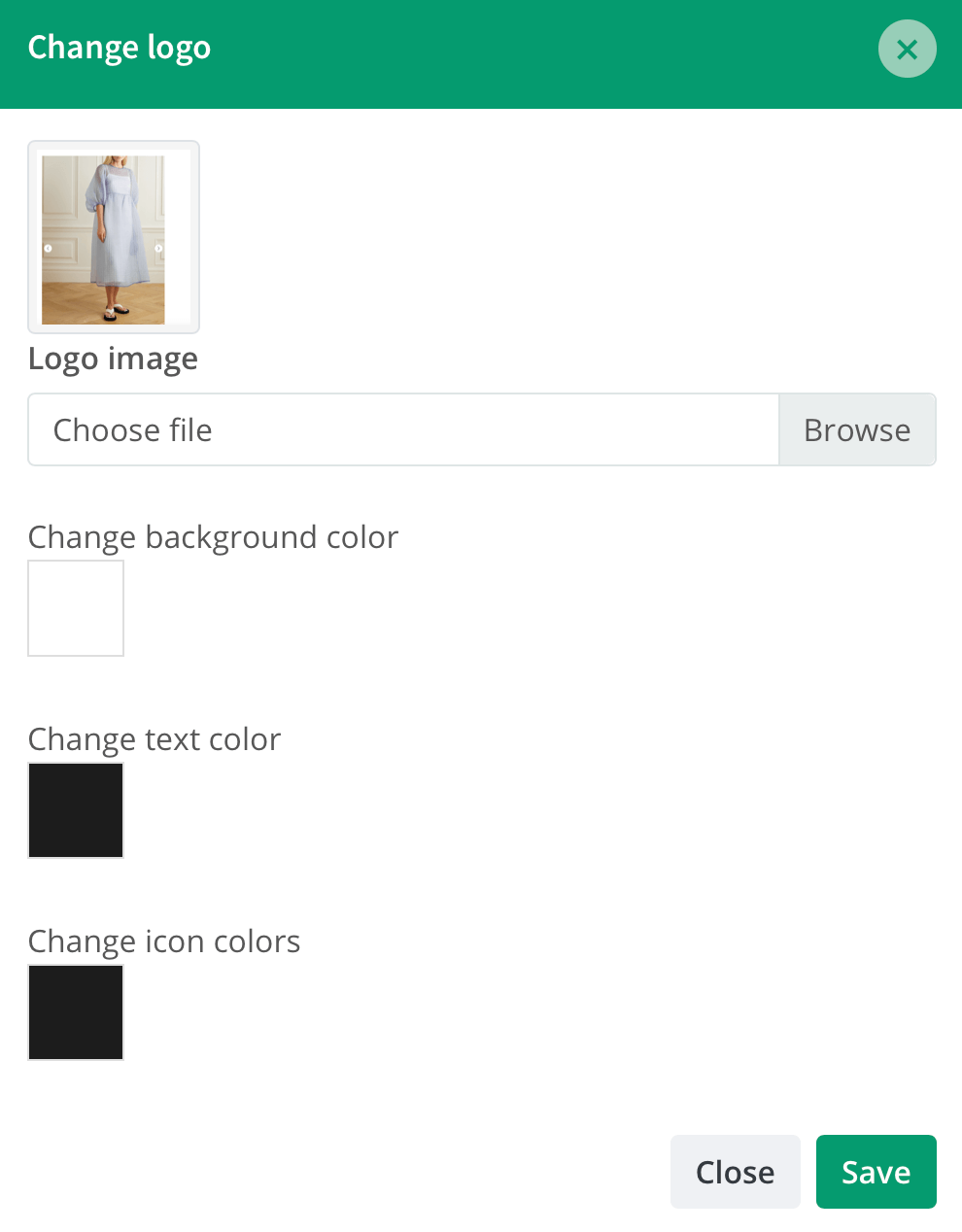
The header is the bar in top of your page. The header contains your logo, menu items and icons (search, basket, profile).
Under header settings you can upload your logo image, change background color, change text color and change icon colors.
Choose the colors you like. You can follow your changes while you make them. When you are finished designing your header press "Save".
You can always change your header.
NOTE: Header and footer are designed separately because they throughout all your pages stay the same. The header and footer in the Meeshop Designer works like Microsoft Words page header and footer.
E.g. (logo, pink background with white text and icons).

Menu Items
The menu items lets you add and edit menu items in the top bar.
To add a menu item simply click "add menu item". This gives you 4 options: Add Home link; Add link to an category; Add link to an page and Add link to a custom url. For each option you can choose if clicking on the menu item should open the page in a new vindue. You can do this by checking the option "open in new window".
Home - Add Home link
This option lets you create a menu item that links to the front page of your webshop. The standard text is "Home", you can change it simply by entering a new text in the text field.
Category - Add link to an category
This option lets you create a menu item that links to the one of your product categories. You need to have created the product category beforehand, for it to show as an option in the drop down. The name of the category is set as the default name. You can change it simply by entering a new text in the text field.
Page - Add link to an page
This option lets you create a menu item that links to the one of your pages. You need to have created the page beforehand, for it to show as an option in the drop down. The name of the page is set as the default name. You can change it simply by entering a new text in the text field.
Custom - Add link to a custom url
This option lets you create a menu item that links to any url you want e.g. a link to your Facebook page. Simply enter the url you want to link to and enter the name you want the menu item to have.
Pages
To start designing your frontpage click on page and then on frontpage.
Start creating your design by creating a new container. Choose from one to four columns. You can always change or delete columns.
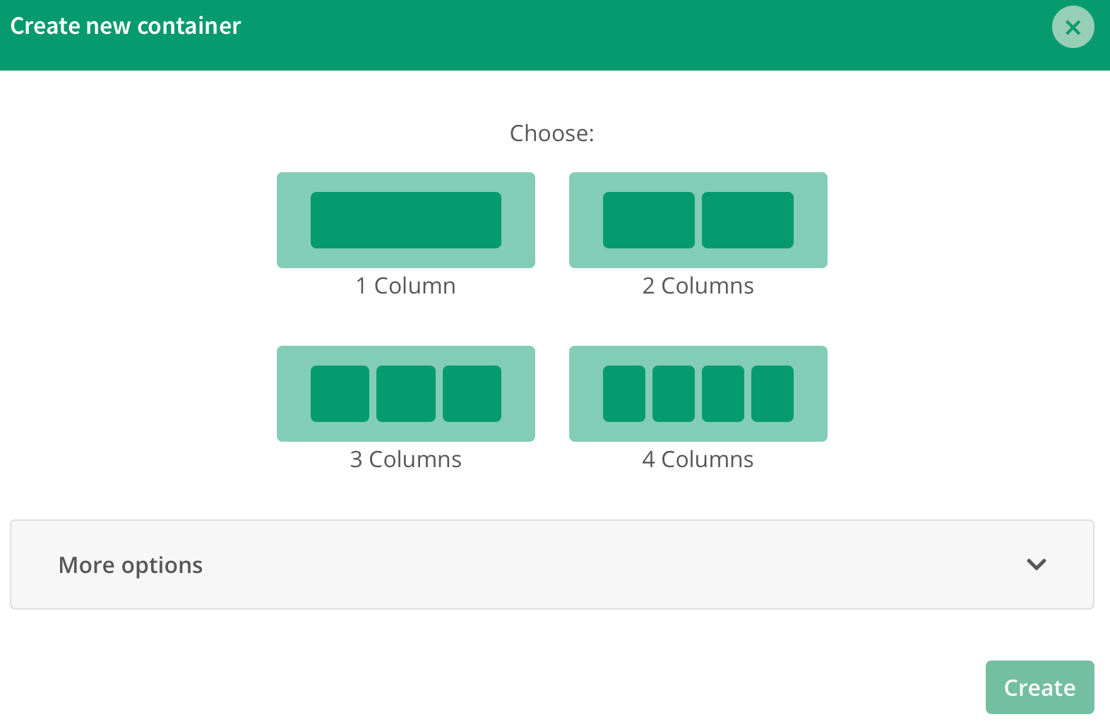
Each column can contain different components. You can choose between eight components: Headline, Image, Products, Text, Video, Carousel, Card, Custom.
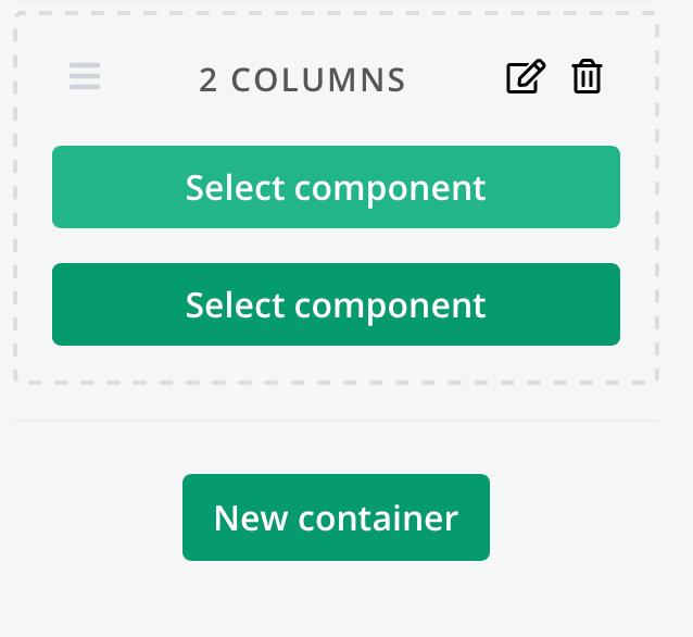
Select the component you want. The various components give your design different opportunities.
Headline:
Make a headline that stands out and helps your SEO.
You can select size, color and adjustment. Additionally, you are free to choose where you want to place the headline and even add a background color.
Image:
Images help make your pages more personal. Place the images side by side or stretch one across the entire width of the page. You can add links to the pictures.
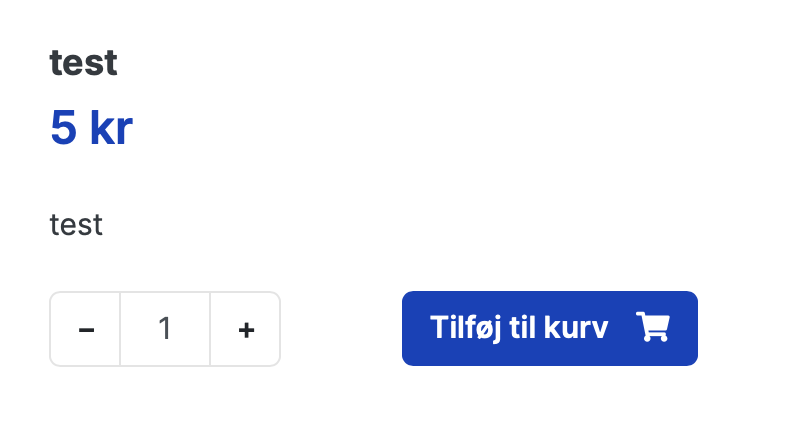
Products:
With selected products, you are free to choose which of your products you want to showcase on your pages. You can choose the number of rows and columns, and whether you display your most recently added products among all your products or from one of your product categories. You can also select specific products you want to display.
Text:
Add easily and quickly catchy text to your page. You can write and edit text directly in the designer. Change font size and colors. You can allso add images, links and more.
Video:
Make your webshop more exciting and personal by adding Youtube or Vimeo videos to your pages. With our video feature, you can add videos that can help present your products and your webshop in a more fun way.
Carousel:
The image carousel can for example be used to create awareness regarding promotions, offers, sale and/or selected products. With our image carousel you can add all the images you want, it's also possible to add links to the different uploaded images.
Card:
Cards makes it easy and clearly for you to pressent information and products. Using the card function you can for example add images with text, icons, colors, size, button and much more. Cards is a good way to present your products and lure your costumers into selected pages.
Custom:
With the custom function, you can get it just the way you want. You can easily add code and unleash both your own and Meeshop's potential.
You can add html, CSS and JavaScript as crazy as you want.
Containers, components and padding.
Make as many containers as you want. You can drag and drop the containers and move them around as much as you like, by dragging the containers you can change the order of them.
You can also drag and drop the components in the containers, this means you can change the order of the components. You can always alter the amount of components in your container by editing the container. (Click on the edit button - the pencil icon- to alter the number of components).
If you want to make gaps between your containers, just click on the edit button - the pencil icon -. Scroll down until padding, you can both make top and bottom padding larger. Drag the white button until the px (pixel) you want. When you add padding, your container and background picture or color will expand without affecting your component.
Footer
The footer is the bar in the bottom of your page. The footer contains information about you and your webshop.
Usually you add general information, contact information, terms and conditions, etc.
It's important your CVR, your contact information and which credit card you accept are displayed on every page.
If you need help to add or change payment logos in your footer follow this guide.
Under footer settings you can change the numbers of columns, change background color, change text color.
You can always add or delete items in your columns. Add links, headlines, text or custom hmtl
When you're finished designing your footer press "Save" in the bottom.
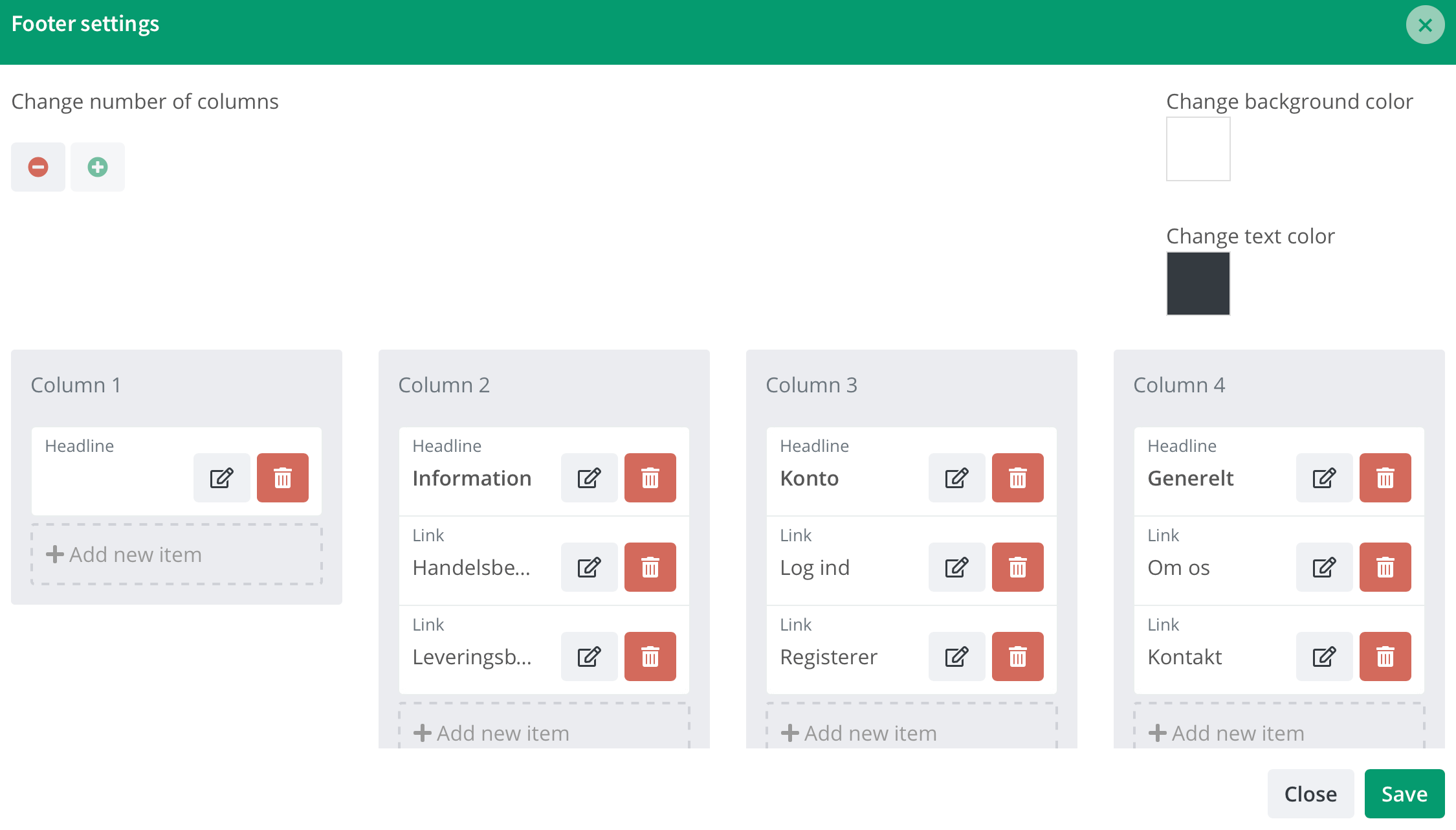
You can always change your footer.
NOTE: Header and footer are designed separately because they are shown on all your pages.
